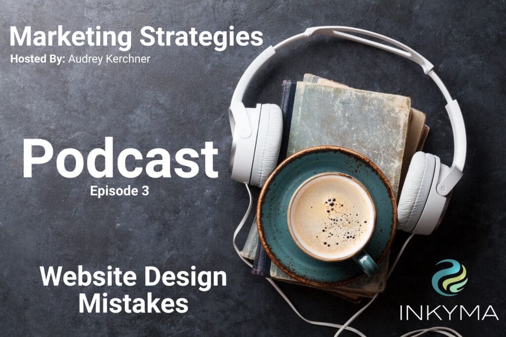
Marketing Strategies Podcast
Episode 3
Top 5 Website Design Mistakes
A website can look beautiful but still not be set up to attract potential customers to buy from you. Function and layout play a big part in the customer buying process.
Are you losing sales because your website isn’t designed with your customer in mind?
In this episode, I share the top 5 website design mistakes that our team commonly sees on websites. These mistakes are about usability, content, and who the site is for.
In the show, I mention previous podcasts where we talk about strategy and branding you can find these podcasts on our main podcast page.
Thanks so much for listening. If you have a question or a show topic suggestion fill out the contact form below. I appreciate all your feedback.
Top 5 Website Design Mistakes Transcript
Welcome to Marketing Strategies with Audrey Kerchner, sponsored by Inkyma. Take your small business to the next level with proven creative solutions designed to grow your awareness and connect to your customers. Now, here’s Audrey.
This is Audrey Kerchner, the co-founder and chief marketing strategist here at Inkyma. Inkyma is what you call a full-service marketing agency. We bring that big agency feel and process to small businesses, and we provide marketing strategy, branding, website design and hosting, content marketing, search engine optimization for our sites, social media, and digital advertising. To learn more about what we do, ask us a question, or to schedule a marketing evaluation, go to our website, inkyma.com.
If you haven’t listened to the show before, no worries. You can just go back and listen to the podcast because we’ve already talked about marketing strategy and we’ve talked about branding. You can listen to those on my website, Podbean, and we’re also on Spotify, and we have a bunch of other channels coming in the weeks and months ahead.
Before I get into this week’s topic, I did have a question that came in from the branding discussion that I put out. In that discussion, I talked about protecting your brand by making sure that all the materials you use are copyright-protected and that you’re not scraping from Google, so images, those sort of things. The question was, “What about audio files? Are they also copyright-protected? Can I get in trouble if I use audio files without permission?”
The answer is yes. All audio files, unless you’re given the explicit rights to use it are copyright-protected. Just like there’s stock photography out there, there’s quite a bit of audio stock out there that you can use for your video. Any type of audio that you’re doing for intro and outro, make sure you’re using stock audio as well, because what you may run into is your big major channels like YouTube, Spotify, Facebook is even doing it. If you’re using protected right audio, they’ll actually either mute it out or they will not publish it to everyone. They’ll actually limit your publishing capabilities or they won’t let you publish it at all, so be really careful there as well. I thought that was a great question that had come up.
Let’s get into today’s topic. Today’s topic, we’re talking about web design, and it’s not just about making the site pretty. Your website for your business is really one of your major investments. Branding is a major investment, any type of big signage that you’re doing, print materials, vehicle reps, and your website. You want to make sure that you’re doing it right, and really to make sure that your website is working for you and isn’t just sitting there.
I want to talk a little bit about the purpose of your website. Obviously, it’s a place for people to go for information, but here’s the important stuff. Number one, it helps potential clients decide to choose you as whatever service or product you’re using. Everybody’s got competition out there, whether they know it or not, so really the main goal of your website is to inform them about what you do, and then for them to choose you.
The second thing it does is it supports your brand. Like I said before, this is one of your big assets, like signage, like a vehicle. When they come there, your brand has to be really strong because people go there once they’ve seen your outbound marketing, if you’ve met someone in a network meeting. One of the first things they do is they go check out your website.
Then the third thing is to inform them about you. A lot of times, folks will put that as number one, when in reality it’s the third spot. The main reason why you got to pay attention to how your website is designed and what’s on there is that if it’s not designed with your customer in mind, right, front, and center, it can actually cost you money. You could lose business if your website isn’t set up the right way. For me as a business owner, that’s the main reason why I make sure that everything on our site is designed for that customer that we’re trying to attract, and I think that should be why this should be important to you as well.
You’re listening to Marketing Strategies. I’m Audrey Kerchner, and this is sponsored by Inkyma who provides marketing designed to grow your business. You can find us at inkyma.com.
I’m going to share five mistakes that I see a lot of people make on their websites that would be costing them money and customers. The first thing that I see a lot is that people put their social icons at the top of their website page. The reason I don’t like this is that someone first comes to your website, they’re looking around. If they see those Facebook, Instagram, and LinkedIn icons, they may be tempted to click away. “Oh, let me go look and see what’s over there.” They haven’t gotten your full message the way that you’ve intended them to receive it.
Facebook, Instagram, LinkedIn, they all have their own formats. You put the content where they tell you to which may not be optimal for you or your company, but that’s the way those sites work. Don’t spend all your time attracting someone to your site, just to get them to click away on something that you have very little control over.
The other thing that I don’t like is people will put them in the upper right hand corner. Research, over years, has shown that that top right corner is your most valuable real estate on your website. You can look at heat maps. You can talk to the guys that do the usability studies of where people like to click and where the eye moves and all that kind of thing. But since I can remember with website development, that top right corner is gold, so don’t put your social icons there. Don’t say, “Hey, you’re going to look here first.” “Let me tell you to go away from my website” is really what that’s doing.
Put those social icons in your footer. After they’ve had a chance to get through your homepage, learn about you, make the decision, “Hey, I like this company. Let me check out their social pages.” They’ll find the icons, right? They’ll where to look for them.
Let’s move on to number two. Number two is no calls to action on the website. What a call to action is, it’s that buy now button, that shop button, the contact us, the contact us form, scheduling a consultation. Many times, none of that is there, or if it’s there, it’s not prominent, meaning it’s really small text type font. That’s the little blue underline link that is so easily missed.
The reason that you want to have strong call to actions on your website, and I prefer three on the homepage in different spots is because, if someone’s come to your site, they like what they see, don’t make them work hard to know what comes next. And so when someone comes to the site, they like you, “Oh, wow. How do I do this?” That’s when they’re going to start looking for those call to action buttons. If they’re prominent, they’re going to be easy to find. It makes the probability of a sale go up when you use those.
Now I did mention, I like to put three on a homepage minimum, top right corner, that valuable real estate spot, usually right under where you would have a hero image. A lot of the modern sites now we have this big, beautiful image. Right up underneath that when they start to scroll and then optionally either somewhere down the middle of the page, if you have a long page, or if you’re only going to do three, then you put it in the footer because they’ll scroll to the bottom, and the one in the footer could be that contact us form.
Number three is you have too much content on the website. Websites and internet usage has evolved over the years. In the past, we used to put a lot of content because people would come and read. We thought people would read. We treated the internet like it was a magazine or a book. But what we know now is that people come to a website and they don’t come to a website to read. They actually skim the content. We want to write content that is skimmable and easy to digest. Think words and phrases, not paragraphs for your main pages, your homepage, your sub pages.
The other reason for this too is that you want an uncluttered website because when someone comes to a website and if it’s cluttered and jammed in, their perception of the company is that you’re hard to work with. You’re hard to deal with. Your website is difficult to navigate, difficult to understand, and so you must be difficult as well.
They associate your company and how you work with how your website is set up. That language that I talked about, the phrases versus the paragraphs, we want to speak to their internal wants and needs, and then how you solve those problems. If you are a cleaning company, you’re going to talk to them about wanting a clean home, wanting more time to themselves. “We can do that because we provide in-home cleaning services on a one time, weekly, monthly basis, custom programs for you.” That right there helps them figure out, “I want cleaning, you offer cleaning.” And then now you got a big buy button or schedule a consultation button, and then you’re ready to go.
I want to take a moment and talk a little bit about search engine optimization in the context of this because I get this question, “If we don’t have a lot of content on the homepage, how’s Google going to optimize us.” The way that we like to do this is we balance your site out. Your main page is brief skimmable content. Let them get to know you very quickly and easily, and then you have a blog.
Every website should have a blog. That’s where your big, long content goes. It’s educational in nature. We do read educational blog posts if we are trying to learn about a topic or a subject. That’s where all your really great search engine optimization goes. You can educate. You can answer frequently asked questions in the blog. I personally don’t recommend you make FAQ pages. I think those should actually be embedded in all of your blog posts that are relatable. That’s where you balance it out. That’s how that search engine optimization question gets answered. Blog, long content. Website, short skimmable content.
The other things that I want you to also consider is don’t use your industry jargon. We all have shortcut and internal language that we use within our industry. If you’re a business-to-consumer business, never include it. Keep it very high level and just normal conversation. If you are B2B, because there is jargon there as well, use your customers. Use their language because then you’re relatable. Don’t use your own jargon and don’t assume that they know yours. Make sure you know theirs.
The last piece I’m going to give you about content in this respect is keep all of your content at a fifth grade reading level. You may have more educated customers. That’s totally fine. Even those folks that can read at a college PhD level, they can read at a fifth grade reading level, and I bet it’s a lot faster and easier for them to skim at that level than at other reading levels. Keep it clear. Keep it simple. Keep it jargon free.
Now let’s move on to number four. Number four is all always a tough one for folks. It’s talking about yourself and your company on your homepage. I get a lot of looks sometimes when I say, “Nope, we’re putting that on the about page.” But they’re like, “Don’t they need to know about me?”
The reality is they’re not there for you. They’re there for themselves. They’re there to figure out if what you provide, your product or service, is a good fit for them and can they get it? That’s why you don’t start talking about how many years you’ve been in business, your philosophy, or even that you care about them, right? They don’t want to know that you care about them until they’ve decided that they want what you were offering. You’ve got to start with that first. And then back to what I was saying in number three, that’s where you talk about the problems that your product solves and then what that product is. Give them a reason to stay, get them engaged so that then they want to click off into other areas like you’re about page where you get to talk about you.
I have a bonus here for you, too. I talked about this in the strategy episode as well. You want to talk to their internal problems versus the external problems. If all you can talk about is the external problems. That’s great. At least you’re talking about their problems and not about you. But if you can step that up and know the internal reason why they have that problem, you’re going to be even better.
Let’s take the example of a company that provides technology services to other businesses. The business may say, “Hey, I need someone to manage my servers and manage my computers.” That’s the external problem. If you talk to that, yeah, it’s going to be great. But if you can sum up in a very short way saying, “We understand that your time and your money is valuable and that you’re concerned about spending too much on technology support, so we have automated systems that cut that pricing or that process time in half.” That’s much more engaging language and their ears are going to perk up even more with you addressing their internal problems versus the external.
The last thing I’m going to leave you with on this particular topic is even when I explain those things, people are still like, “No, I really need to tell them about me.” Imagine that you’re in a networking meeting or you meet someone for the first time, and they say to you, “What do you do?” Are you going to say, “I’ve been in business for 25 years, and our company philosophy is that we really help people with this, and we care about our customers.”
No, the first sentence out of your mouth hopefully is going to be, “We provide technology services to business.” There has been so much money spent on people creating these elevator pitches, and we have it in our head that when we speak to someone, we tell them immediately what we do so that they get it and understand it quickly, and we don’t bore them. It’s the same philosophy that we need to use with our website copy.
Finally, number five, and this is a big one. What I see on a lot of websites is that there is no lead generation mechanism. When someone comes to your site, they may like you. You might have all the right language there. They might say, “Wow, this is awesome. This is great.” But they’re not ready at that moment in time to buy. The buy buttons, the schedule of time them to talk, the first point of contact with a human being, they may not be ready for it. Mentally, they may say, “I’m going to remember this company, and I’m going to come back.”
Think about how many times you and I have done that, and then how many times we’ve sat there a month later, a week later, sometimes for me it’s the next day going, “Oh, my gosh, what was that company? What was that URL? What was that name?” That’s what the purpose of a lead generation mechanism is. It’s to get people to take that secondary call to action, which is signing up for a newsletter, signing up for a lead magnet, filling out a calculator on the site, so that you can capture their you email address, and then you can stay in contact with them. What that does is even though they’re not ready to buy, you can put them into a sales funnel, or onto your newsletter, and you show up in their inbox, monthly, weekly, whatever the mechanism is, so that when they are ready, they know, “Oh, yeah. That company emailed me. I, their newsletter, let me go find that.”
And because at that point they’ve probably seen your name, 2, 3, 5, 7 times, it’s easier to recall. It’s that frequency that brings them closer too because that frequency builds trust. So make sure that you have those secondary calls to action, that lead generation mechanism on your website. I like to put those closer to the bottom of the site because when you think about the process of going through a site, “Oh, yes, this is what they do. I like seeing that. They’re telling me more. I really, really like them. I’m not ready to buy yet, but I do want to sign up for this newsletter,” and get that lead magnet.
The lead magnet is great. What you want is for that to be something that is valuable to them, where they are in their buyer intent process. So in the sales process, we have intent. “I need to educate myself because I’m going to buy something like this in the future.” If your lead magnet, let’s say for a real estate agent, for people that are getting ready to buy a home, a mortgage calculator. They fill it out. They click the submit button. They get a message that says, “Give us your email address, and we’ll send you what you can afford or whatever,” or top 10 things to do to get your house ready to go on the market. That’s a one page white sheet, and if you’re getting ready to sell your house, that’s valuable to you at that moment in time.
I don’t recommend giveaways, and I don’t recommend gift cards because those are not specific to the buyer intent process. Those are just something like, “Hey, that’s really cool. I want an iPad. I may never use this company. I’m not in the market for it right now, may never be, but I’m going to sign up anyway just to get a chance to win that or get that gift card.” Stay away from those and do something educational that is part of the sales cycle and intent process.
That was a lot of information that I just gave you. I always like to add this at the end where I give you a little bit of homework, and I ask you to take action. The action I want you to take is to look at your website and see which of these five things are missing from your website structurally.
If you’ve done your own website, then I want you to take each one in its turn and add it to the website. If your social icons are at the top, that one’s pretty easy. Pull those out. If you got to rewrite content, take that into sections and rewrite it.
If you didn’t do your own website, if you have hired and retained a website designer, and you see that these things are missing, schedule a time to talk to them about the things that you want to add and why. Just make sure as you’re having that conversation with them that they understand what you’re trying to do and why you’re trying to do it. Probably the most important part is, are they on board with it? Do they understand it philosophically? Are they capable of doing it? A lot of people in my industry don’t employ writers. They’re a web designer themself, but they don’t like to write, so they ask the client to give them a copy. And so you have to keep that in account with your web designer.
Now, just to take a quick step back, here at Inkyma, all of these things I’ve talked to you about, we include in every single website that we design for our clients. We educate our clients on why this is important and how it’s going to help their business, and then we have writers on staff. We do all of their writing. We do the usability things that are important. If you’re loving this type of content and you’re like, “Oh, my gosh, I need to do my website over again, then you can certainly reach out to us.” But if you have someone that you like to use that you’re comfortable with, just make sure that they’re, one, capable of doing this and that they’re on board with doing this. The last thing I want you to do is say, “Hey, I want you to do all these things,” and they don’t understand why you want to do them, or they don’t know how to do them.
Again, going back to that example of copywriting, and then you may need to get your own copywriter that understands how to write this way because not all writers know how to write this way. A lot of website writers that I meet want to write you paragraphs and paragraphs of content and they don’t know how to edit and distill a message down into sentence and phrases. I don’t want you to create yourself any headache or anything like that because the philosophy of web design, and what its purpose is so very different than the colors and the images and how pretty it is. It has to be beautiful, it has to be functional, and it has to help you get customers.
You’re listening to Marketing Strategies. I’m Audrey Kerchner, and this is sponsored by Inkyma who provides marketing designed to grow your business. You can find us at inkyma.com.
Here at Inkyma, we like to give back to our business community. I provide a free 45-minute marketing consultation to anyone, regardless if you’re looking for a marketing company or not. Maybe you won’t talk in a more detail about one of these five things, that’s not a problem, and then you go and execute it yourself.
You can just go to the website, inkyma.com, and click on the schedule a marketing evaluation button, and we’ll spend 45 minutes talking. If you just have a quick question, then you can go to the footer of the web site, fill out the contact form, and then I will make sure that a response gets out to you.
That’s it for this week. Just to give you a little bit of a teaser, next week we’re going to talk about web hosting, and it’s not going to be as boring or as dreary as that sounds. It’s actually going to be really useful from a business owner perspective. Stay tuned for that, and have an amazing day.
Thanks for listening to Marketing Strategies with Audrey Kerchner, sponsored by Inkyma. From strategy to execution, Inkyma could create effective marketing plans designed to grow your business with branding, website design, content marketing, and digital advertising. That’s inkyma.com, and be sure to listen to the companion podcast on Podbean anytime.


